Using Chart.js for the Solar Updates
Solar UpdateBlogWebsiteChart.js
I've been doing some solar updates on this blog for a few months but one of the things that has bothered me was the charts that I was producing. They are just PNG images of an excel sheet that I created. Initially I thought these would be good to have but I've since reconsidered, especially as the charts are usually very hard to read given their small size.
For the past month I've been experimenting with using Chart.js to render the solar panel information that I have and I am pretty much ready to release this initial attempt. I haven't yet updated all of the previous posts but I will get around to doing that in the next week or two.
First Attempt
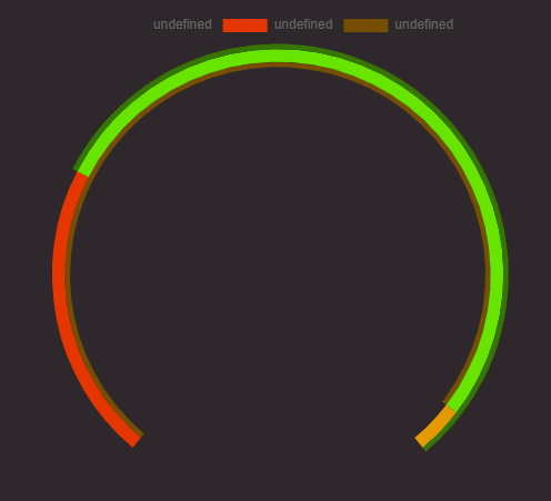
I bashed away at Chart.js outside of this blog and away from Next.js or React just so I could get something working. I was also trying to replicate the same donut chart that the MyEnergi app has as it's daily chart.
<script src="https://cdn.jsdelivr.net/npm/chart.js@3.0.0/dist/chart.min.js"></script>
<script>
    const ctx = document.getElementById("myChart");

    new Chart(ctx, {
    data: {
        labels: ["Un", "Deux"],
        datasets: [
        {
            type: "doughnut",

            data: [6.9, 18.1],
            borderWidth: 1,
            backgroundColor: ["hsl(0, 0%, 100%,0)", "hsl(93, 100%, 23%)"],
            weight: 2,
        },
        {
            type: "doughnut",
            data: [6.9, 17, 1.1],
            borderWidth: 1,
            backgroundColor: [
            "hsl(14, 100%, 45%)",
            "hsl(93, 100%, 45%)",
            "hsl(40, 100%, 45%)",
            ],
            weight: 5,
        },

        {
            type: "doughnut",
            data: [23.9, 1.1],
            borderWidth: 1,
            backgroundColor: ["hsl(40, 100%, 23%)", "hsl(0, 0%, 100%,0)"],
            weight: 2,
        },
        ],
    },
    options: {
        rotation: 220,
        circumference: 280,
        cutout: "90%",
        borderColor: "hsl(0, 0%, 100%,0)",
    },
    });
</script>

As you can see from the image I haven't gotten the hang of the labels, at least not in the wy that I wanted for this type of chart. I may return to these charts in the future.
Second Attempt
For the second attempt, I tried to integrate what I had learned form the first attempt and put this into a blog post from this site. This meant integrating with Next.js and React in some way so I installed the Chart.js and react-chartjs-2 modules. I started with one component and all I was doing was showing the list of values that I had added to one of the blog posts. The theory was if I can display this information then I can plug it into a chart instead.
export default function TotalGeneratedExportedPerDayChart({
  startDate,
  endDate,
  exported,
  generated,
}) {
  return (
    <b>
      {startDate} {endDate} {exported} {generated}
    </b>
  );
}
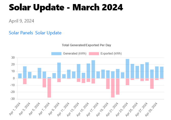
This worked, so I then tried to use a chart to show the values instead. I was using some code I found which had useState and useEffect to render the chart. Again I was just trying to get something to display at this stage, throwing stuff at the wall to see what would stick.
export default function TotalGeneratedExportedPerDayChart({
  month,
  year,
  exported,
  generated,
}) {
  const chartRef = useRef(null);
  const [exportedData, setExportedData] = useState([]);
  const [generatedData, setGeneratedData] = useState([]);

  useEffect(() => {
    setExportedData(exported);
    setGeneratedData(generated);
    if (chartRef.current) {
      if (chartRef.current.chart) {
        chartRef.current.chart.destroy();
      }

      const context = chartRef.current.getContext("2d");

      const newChart = new Chart(context, {
        type: "bar",
        data: {
          labels: getDates(parseInt(month), parseInt(year)),
          datasets: [
            {
              data: generatedData,
              label: "Generated (kWh)",
            },
            {
              data: exportedData,
              label: "Exported (kWh)",
            },
          ],
        },
        options: {
          plugins: {
            title: {
              display: true,
              text: "Total Generated/Exported Per Day",
            },
          },

          responsive: true,
          scales: {
            x: {
              stacked: true,
              grid: {
                display: false,
              },
            },
            y: {
              stacked: true,
            },
          },
        },
      });

      chartRef.current.chart = newChart;
    }
  }, [exportedData]);

  return (
    <div>
      <canvas ref={chartRef} />
    </div>
  );
}

const getDates = (month, year) =>
  Array.from({ length: new Date(year, month, 0).getDate() }, (_, i) =>
    new Date(year, month - 1, i + 1).toLocaleDateString(undefined, {
      dateStyle: "medium",
    })
  );
This did work, however I soon realised that navigating between two posts in the blog did not update the chart. So when I navigated back to the March 2024 post, the chart was still showing April 2024 figures.

Third Attempt
I was getting closer but I had no idea how to fix this reloading issue. I tried messing with useState and with a chart.reload() function that was available but nothing worked. Until I realised that I hadn't tried using the react-chartjs-2 module to render my charts. I had initially tried this for the second attempt but for some reason I couldn't get it working so I went back to it for this third attempt. Not only did it make the code look better by getting rid of the useState and useEffect code, it also resolved my reloading problem.
import { Bar } from "react-chartjs-2";
import { Chart } from "chart.js/auto";
import { CategoryScale } from "chart.js/auto";

export default function TotalGeneratedExportedPerDayChart({
  month,
  year,
  exported,
  generated,
}) {

  Chart.register(CategoryScale);

  return (
    <Bar
      data={{
        labels: getDates(parseInt(month), parseInt(year)),
        // datasets is an array of objects where each object represents a set of data to display corresponding to the labels above. for brevity, we'll keep it at one object
        datasets: [
          {
            data: generated,
            label: "Generated (kWh)",
          },
          {
            label: "Exported (kWh)",
            data: exported,
          },
        ],
      }}
      options={{
        plugins: {
          title: {
            display: true,
            text: "Total Generated/Exported Per Day",
          },
        },

        responsive: true,
        scales: {
          x: {
            stacked: true,
            grid: {
              display: false,
            },
          },
          y: {
            stacked: true,
          },
        },
      }}
    />
  );
}

const getDates = (month, year) =>
  Array.from({ length: new Date(year, month, 0).getDate() }, (_, i) =>
    new Date(year, month - 1, i + 1).toLocaleDateString(undefined, {
      dateStyle: "medium",
    })
  );
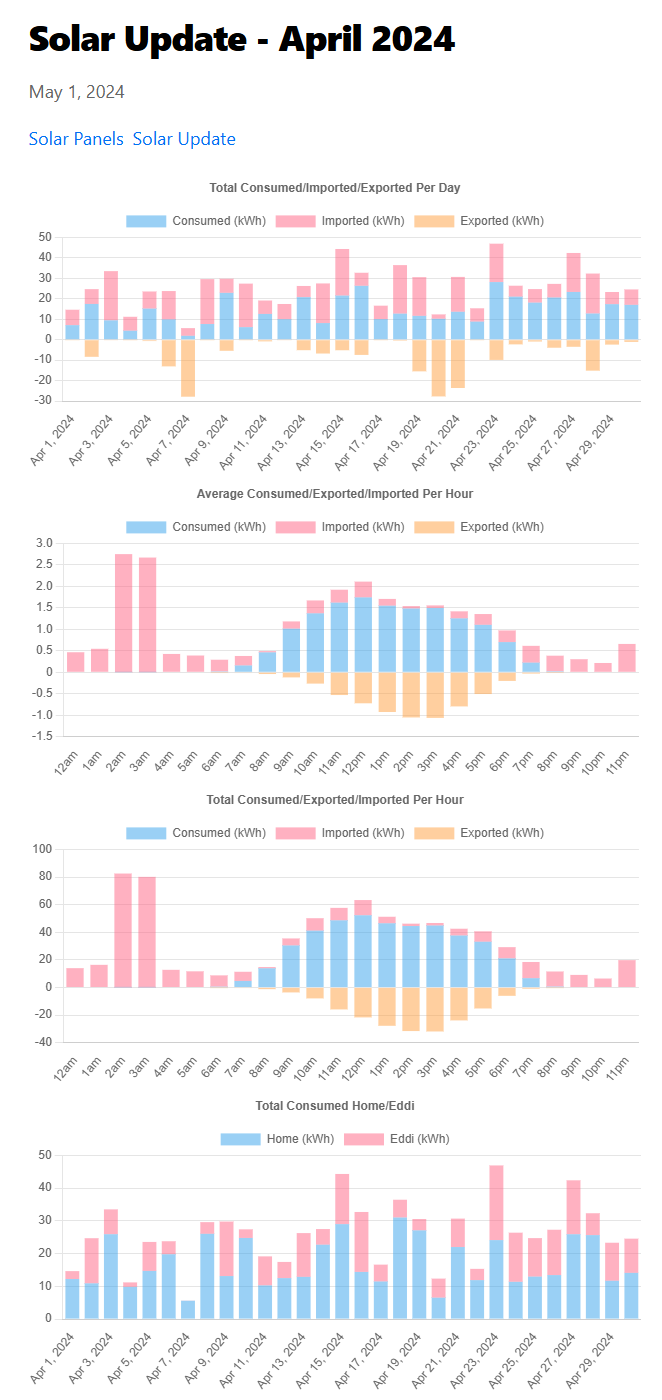
Once this was working, I expanded the data that was coming from the blog posts for the other charts and created different components to render the different charts. The data is read from the blog post metadata and loaded into each component. The data is copied from the excel sheet that I had been using to create the old image charts and I hope it will be an easier process to copy for each new monthly update.

Advantages
- I think the charts are much clearer to read compared to the old images.
- Chart.js has the ability to show tooltips when hovering over each chart element so you can actually see the figures properly too.
- It should be easier to copy the chart data to the blog post than having to copy the chart to an image and upload it.
Improvements
- I'm still copying the data manually, ideally I would like this coming in automatically based on the month and year.
- The charts are still quite small on mobile devices.
- I don't have all of the previous solar updates completed yet.
- I would like to have the donut chart working in some capacity, maybe showing my solar generation for each blog post.
- Generally the blog code itself is a bit messy, mostly due to this being my first attempt at a Next.js site.
Learnings
- I really don't know enough about what
useEffectanduseStateare for or where to use them - Chart.js is good for simple charts but I'm not sure how easy it is to use for more complex charts like the donut one. More investigation is needed.
Paddy
